
The big shake-up of the Elizabeth line linking up the core tunnels to the mainline services means a new tube map is required, and with a new map comes a new cover art design.
Apart from the obvious expected changes at Paddington and Liverpool Street stations for the Elizabeth line, there’s been a handful of other minor changes, and one big change in Southeast London with the layout of stations shuffling around.
The tube map differences in detail
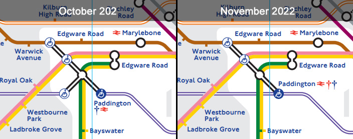
Paddington station
The station has been cleaned up a bit now that there are direct trains on the Elizabeth line, but has gained a second dagger in the process to indicate that services may vary — that’s because a tiny handful of early morning Elizabeth line trains start from the mainline platforms.
Bank station
The interconnections have been slightly tweaked to show the Northern line as being equidistant between the Central and Circle/District lines, which more accurately reflects the situation in the station

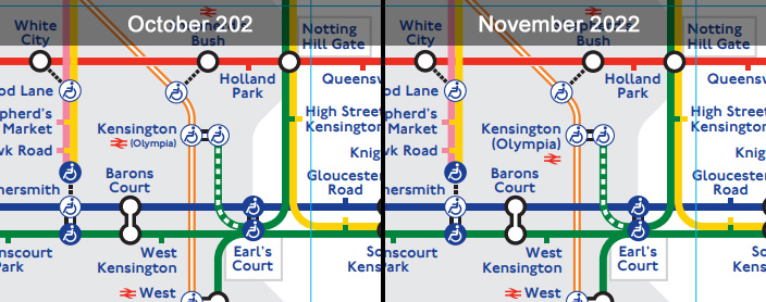
Kensington Olympia station
The map has changed how the station name is displayed
Liverpool Street station
As with Paddington, the connection with the Elizabeth line has been cleaned up, but the station still looks a mess, mainly due to the extra blob needed for the London Overground to show step-free access is from street to platform, but not onto the train.
The station also gains a dagger, for the same reason as Paddington.

Mile End
The Central line at Mile End has been tweaked to allow for the junction of the Elizabeth line, and Bethnal Green station’s name is now on two lines instead of one. The kink in the Central line is still there, but shrunk a bit.

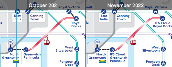
Cable Car
The cable car having dropped the Emirates branding for a few months has now added the IFS Cloud branding
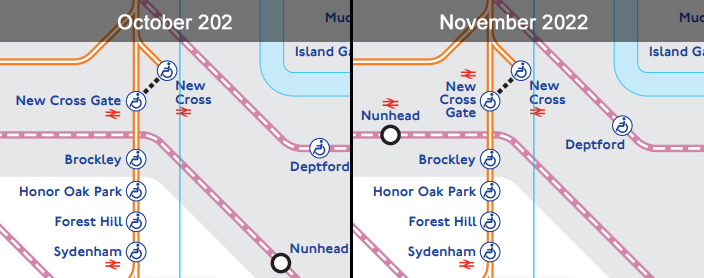
Nunhead
This is geographically probably the biggest change in the tube map in many years, as Nunhead station jumps sharply to the left moving from one side of Brockley to the other. That does more accurately reflect the placement of the station though, so a change that’s likely to be welcomed by local residents.
The change also means that the way New Cross Gate station name is shown has to be compressed a bit.
Deptford station also shunts westwards by a bit.
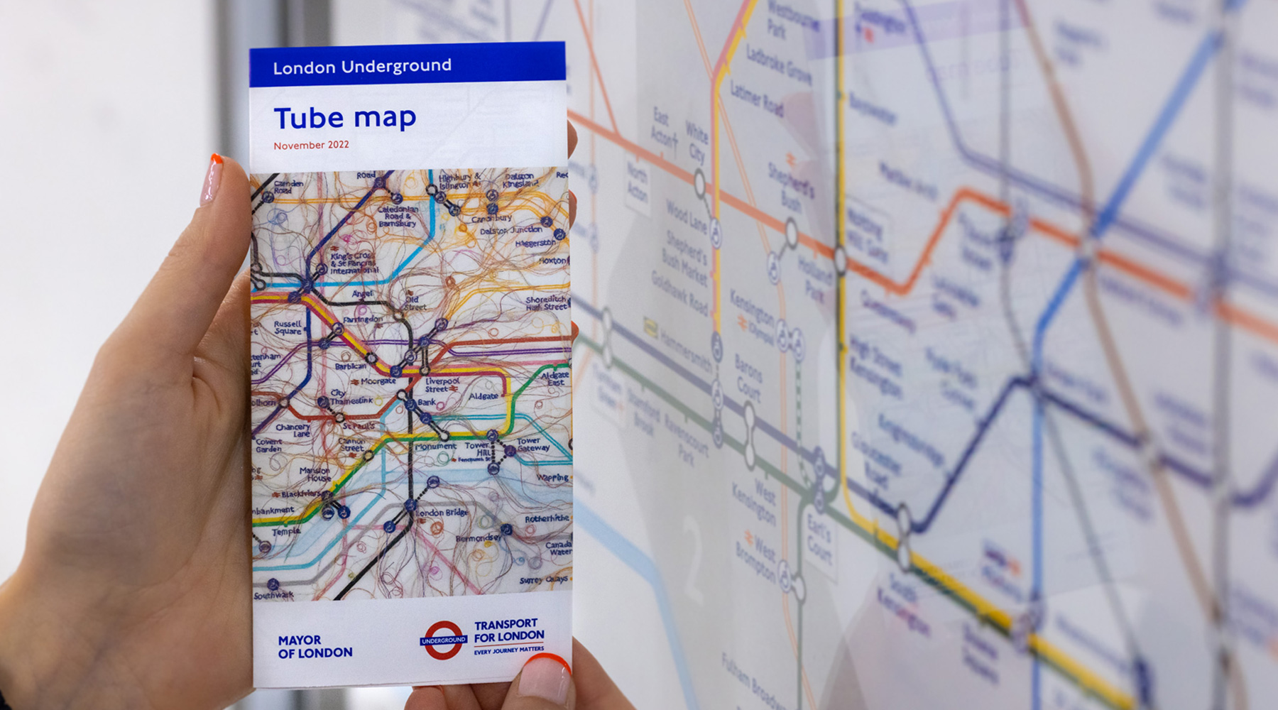
The new tube map cover art
The latest artwork for the tube map leaflets is by London-based artist Do Ho Suh, and is an embroidered facsimile of the tube map focusing on the routes that he habitually uses around his home and studio.
It’s supposed to show how the tube map is a dominant structure we use to navigate, when in fact many of our journeys are filaments between the stations along the streets.
It does admittedly look a bit “furry” though.
(c) TfL
Do Ho Suh commented: “For over a decade, I have put my roots down in London and made it my home – both of my children were born here – so it is a privilege to work on TfL’s iconic Tube map. At heart, so much of my work is about the transportability of space, about what we carry with us as we move through the world, so I’ve loved working on an actual map and thinking about the gaps between the locations and complicating the neatness of the lines.”
You can pick up the tube map leaflet at tube stations.

Tube maps at Woolwich station
This article was published on ianVisits
SUPPORT THIS WEBSITE
This website has been running now for just over a decade, and while advertising revenue contributes to funding the website, but doesn’t cover the costs. That is why I have set up a facility with DonorBox where you can contribute to the costs of the website and time invested in writing and research for the news articles.
It’s very similar to the way The Guardian and many smaller websites are now seeking to generate an income in the face of rising costs and declining advertising.
Whether its a one-off donation or a regular giver, every additional support goes a long way to covering the running costs of this website, and keeping you regularly topped up doses of Londony news and facts.
If you like what your read on here, then please support the website here.
Thank you
The post A new tube map and cover art to mark the Elizabeth line changes appeared first on ianVisits.


